TIME MAGAZINE COVER — EDITORIAL MASTER EDITION
Before using the prompt, set ur headline and subheadline in the begining of the prompt. [INSERT HEADLINE HERE] [INSERT SUBHEADING HERE]
 Before
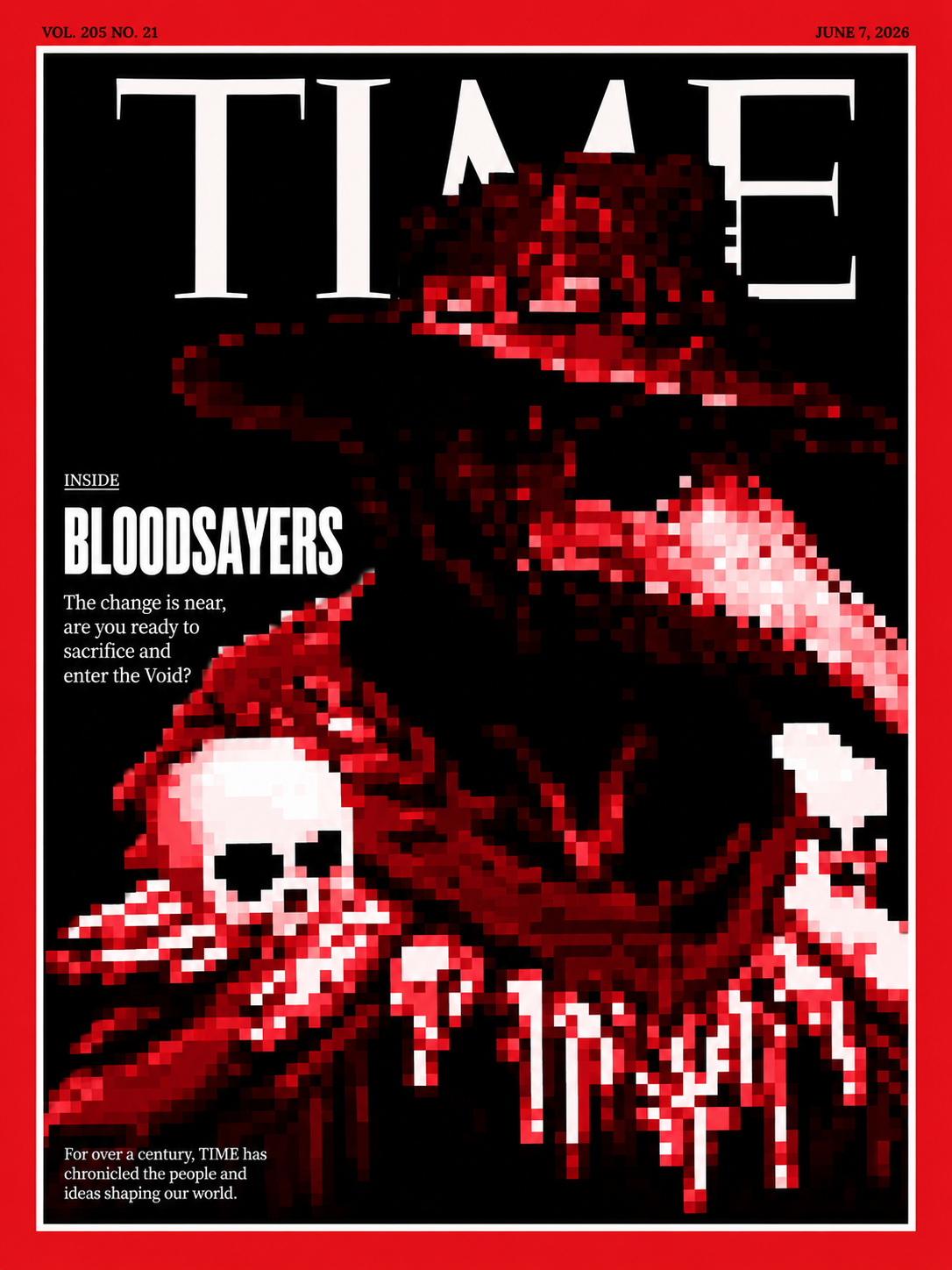 After
AfterFull prompt
TIME MAGAZINE COVER — EDITORIAL MASTER EDITION ━━━━━━━━━━━ USER INPUTS ━━━━━━━━━━━ HEADLINE: [INSERT HEADLINE HERE] SUBHEADING: [INSERT SUBHEADING HERE] ISSUE NUMBER: VOL. 205 NO. 21 MASTHEAD: TIME EDITORIAL STATEMENT: For over a century, TIME has chronicled the people and ideas shaping our world. ISSUE DATE: Use today's date minus 5 calendar days. Display in authentic TIME format: MONTH DAY, YEAR Example: JUNE 1, 2026 ━━━━━━━━━━━ PRIMARY OBJECTIVE ━━━━━━━━━━━ Transform the uploaded artwork into the centerpiece of a world-class TIME magazine cover. The artwork is the hero. The magazine design exists solely to elevate the artwork. The viewer's eye must immediately lock onto the artwork before noticing the masthead, typography, or background. The final image should feel like a genuine TIME cover photographed and art-directed at the highest editorial standards. The finished result should be believable enough to sit on a real newsstand. ━━━━━━━━━━━ COMPOSITION LOCK (ABSOLUTE REQUIREMENT) ━━━━━━━━━━━ The uploaded artwork must occupy approximately 80–90% of the cover height. The artwork must be cropped large. The artwork should feel slightly too large for the page. The artwork may overlap the TIME masthead. The artwork may never cross the white inner frame. The artwork must remain fully contained inside the white inner frame. No portion of the artwork may touch, cross, or overlap the red border. No portion of the artwork may touch, cross, or overlap the white inner frame. The white inner frame must remain visible on all four sides. The artwork should visually fill the page while remaining completely contained within the white inner frame. The viewer should perceive the artwork first and the masthead second. The artwork must dominate the page. Do not zoom out. Do not show excessive empty space. Do not center the artwork in a poster-style composition. Fill the frame with the artwork. The artwork must occupy more visual space than the combined area of all typography on the cover. ━━━━━━━━━━━ TIME BORDER + TOP BAR SYSTEM (ABSOLUTE REQUIREMENT) ━━━━━━━━━━━ Create a classic TIME cover frame using this exact structure: 1. Thick TIME-red outer border. 2. Thin white inner frame line. 3. Artwork positioned inside the white inner frame. 4. The white frame must remain thin and elegant. 5. The white frame must never become a thick white border. This structure is mandatory. The final cover must immediately read as a genuine TIME magazine cover. ISSUE NUMBER Display exactly: VOL. 205 NO. 21 Position: Top-left corner. Inside the red border. Outside the artwork area. Outside the white inner frame. The issue number must be BLACK. DATE Display the dynamically calculated issue date. Position: Top-right corner. Inside the red border. Outside the artwork area. Outside the white inner frame. The date must be BLACK. BORDER RULES Outer Border: TIME Red. Inner Frame: Thin White Line. Issue Number: Black. Date: Black. Do not remove the white inner frame. Do not create a thick white border. Do not place issue information on top of the artwork. Do not place date information on top of the artwork. The red border and white inner frame are mandatory visual elements. ━━━━━━━━━━━ FRAME INTEGRITY RULE (ABSOLUTE REQUIREMENT) ━━━━━━━━━━━ The white inner frame is a hard boundary. Nothing may cross it. The artwork must remain entirely inside the white inner frame. Typography must remain entirely inside the white inner frame. The white inner frame must remain visible and uninterrupted on all four sides. The final cover should appear professionally printed. No element should appear cropped by the border. ━━━━━━━━━━━ COVER TEXT LAYOUT (ABSOLUTE REQUIREMENT) ━━━━━━━━━━━ Use authentic TIME magazine typography and hierarchy. Display the cover story exactly in this structure: INSIDE [INSERT HEADLINE HERE] [INSERT SUBHEADING HERE] The word INSIDE must appear directly above the headline. INSIDE should be significantly smaller than the headline. The headline should be the largest text element on the cover after the TIME masthead. The subheading should sit directly beneath the headline. The headline and subheading should appear grouped together in a single editorial block. The editorial block should occupy approximately 15–20% of the cover area. Position the editorial block on the left side of the cover. The editorial statement: "For over a century, TIME has chronicled the people and ideas shaping our world." must appear on the cover. Do not invent additional headlines. Do not invent side stories. Do not invent teaser text. Do not invent secondary cover stories. Do not invent pull quotes. Do not invent callouts. Use only the supplied text. ━━━━━━━━━━━ EDITORIAL STATEMENT PLACEMENT (ABSOLUTE REQUIREMENT) ━━━━━━━━━━━ Display the editorial statement exactly as: "For over a century, TIME has chronicled the people and ideas shaping our world." Position: Bottom-left corner. Inside the white inner frame. Above the bottom border. Below the headline block. The editorial statement must be small. The editorial statement must be secondary. The editorial statement must never compete with the headline. The editorial statement should feel like a genuine TIME magazine footer element. Do not reposition the editorial statement elsewhere on the cover. ━━━━━━━━━━━ ARTWORK PRESERVATION (ABSOLUTE PRIORITY) ━━━━━━━━━━━ Faithfully reproduce the uploaded artwork. Preserve: original composition original colors original textures original proportions original visual relationships original visual hierarchy Do not reinterpret. Do not redesign. Do not simplify. Do not stylize. Do not reconstruct elements. Do not merge elements. Do not invent new artwork. Do not alter proportions. The artwork must remain instantly recognizable. Increase brightness and local contrast of the artwork if necessary while preserving the original artwork. ━━━━━━━━━━━ MASTHEAD RULES (ABSOLUTE REQUIREMENT) ━━━━━━━━━━━ The TIME masthead should occupy approximately 50–65% of the cover width. Do not make the masthead oversized. Do not allow the masthead to dominate the cover. The artwork must visually dominate the masthead. Approximately 20–40% of the masthead should be obscured by the artwork. The masthead must remain readable. The masthead may only be: WHITE or BLACK Choose whichever creates the strongest contrast against the artwork. The masthead should feel elegant, editorial, and secondary to the artwork. Avoid oversized mastheads that overwhelm the composition. ━━━━━━━━━━━ TEXT COLOR RULES (ABSOLUTE REQUIREMENT) ━━━━━━━━━━━ All editorial typography must be either: WHITE or BLACK Choose whichever provides the strongest readability. Do not use: colored typography gradients glow effects outlines shadows special effects Typography should feel authentic to TIME magazine. ━━━━━━━━━━━ BACKGROUND (ABSOLUTE REQUIREMENT) ━━━━━━━━━━━ The background is not a subject. Use a pure black background whenever possible. If a pure black background is not possible, use colors and textures already present within the uploaded artwork. Do not introduce new environments. Do not introduce walls. Do not introduce brick textures. Do not introduce galleries. Do not introduce museums. Do not introduce architecture. Do not introduce scenery. Do not introduce photographic environments. The artwork should appear to exist directly on the cover. The viewer should barely perceive a background. The artwork must dominate the entire page. If forced to choose between showing more artwork or more background, always show more artwork. ━━━━━━━━━━━ LIGHTING ━━━━━━━━━━━ Professional editorial lighting. Museum-quality presentation lighting. The artwork should be brighter than the environment. Use soft directional lighting. Use subtle highlights and shadows to reveal texture. Create depth without obscuring details. The artwork should feel illuminated and celebrated. Avoid overly dark compositions. Avoid hiding artwork details. ━━━━━━━━━━━ TIME COVER PHOTOGRAPHY RULE ━━━━━━━━━━━ Follow the composition philosophy of iconic TIME covers. Key characteristics: extremely large subject minimal empty space subject fills the page masthead partially obscured typography grouped tightly strong editorial hierarchy The artwork should feel culturally important. The artwork should feel worthy of a major cover story. The subject should feel larger than life. The subject should visually overwhelm the page. ━━━━━━━━━━━ SIMPLICITY RULE (ABSOLUTE REQUIREMENT) ━━━━━━━━━━━ When choosing between adding design elements and removing design elements: Always remove. The strongest cover is the simplest cover. Artwork first. Typography second. Everything else third. Do not add decorative elements. Do not add unnecessary visual effects. Do not add additional graphic devices. Do not add visual clutter. Favor restraint. Favor simplicity. Favor authentic editorial design. ━━━━━━━━━━━ REFERENCE STRUCTURE (ABSOLUTE REQUIREMENT) ━━━━━━━━━━━ Match the layout structure of a classic TIME cover: Thick red outer border Thin white inner frame Black issue number in red border (top-left) Black date in red border (top-right) Moderately sized TIME masthead Artwork overlapping masthead INSIDE kicker above headline Left-side editorial text block Editorial statement bottom-left Pure black or artwork-derived background Artwork dominating the page When choosing between artistic creativity and authentic TIME structure: Always choose authentic TIME structure. ━━━━━━━━━━━ FINAL RESULT ━━━━━━━━━━━ Create a cover that feels: iconic collectible prestigious culturally important museum-worthy editorially authentic world-class instantly believable The uploaded artwork must be the reason someone picks up the magazine. The viewer should first notice the artwork. Then the TIME masthead. Then INSIDE. Then the headline. Then the subheading. The artwork should dominate both the cover and the viewer's attention. The final cover should resemble a genuine TIME cover first and an artwork presentation second. The final image should look indistinguishable from a genuine TIME magazine cover displayed on a real newsstand. A cover people would stop, stare at, photograph, share, and want to own.